Analysis of the 2017 Elite Men World Championship
Billy Fung / 2017-09-27
196 starters, 44 countries and 267.5km around Bergen
With another season of cycling gone by, another world championship race means data to look at. Ok so I was a bit tired of doing work and saw that somebody had scraped the data so I took a quick look into it. The world championship race is a bit more interesting because the riders are grouped by country, and some countries don’t have as many riders in the race. Usually this means that a country with more riders should be at an advantage to win.
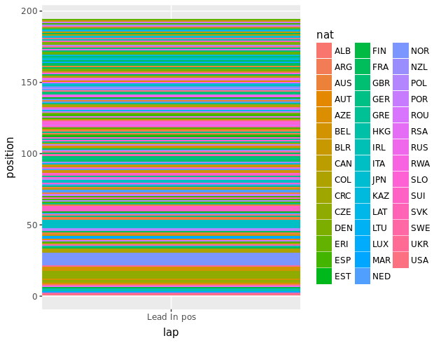
This plot doesn’t really show much except how dispersed most of the riders are at the start line. All 44 countries being represented nicely.
Something I was most curious about is how the riders the top 3 finishing nations moved throughout the race. If there was more granular data (more checkpoints at which positions were taken) then it would make for a more insightful look into how a rider races.
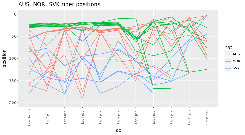
I knew that Slovakia had a smaller team compared to Norway and Australia, so this should place them at a disadvantage, especially when their leader is marked as a favourite. And you can tell that the Slovak team had riders placed pretty sparsely whenever they crossed the lap finish line. Whereas Australia and Norway had their riders pretty close to the front as a group for a large portion of the race.
If there was another checkpoint for position, then it would’ve been interesting to see how much yoyoing between checkpoints each rider does. This might be useful to see in terms of knowing which rider follows which attack, and then trying to get a metric for how much effort a rider as spent. Riding all day in the back of a pack takes less effort than being near the front and following attacks and changes in speed.
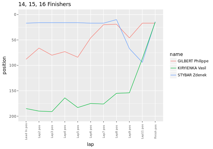
I took a look at the top 20 finishers, and one rider that stood out was Vasil Kiryienka. For most of the race he was at the back of the peloton as they crossed the lap finish line, and then he very effectively moved up and finished 15th. Kiryienka is from Belarus, a nation with 3 riders in the race, so this meant that they probably rode solo, and maybe had 1 rider be the waterbottle/food fetcher. You can play with this interactive plot of top 20 finishers here.
Along with that plot of top 20 finishers, I also have one for all nations, so you can take a look at how riders of each nation positioned themselves. This will let you see if maybe Belarus had all their riders together and then they helped Kiryienka move up, or not.
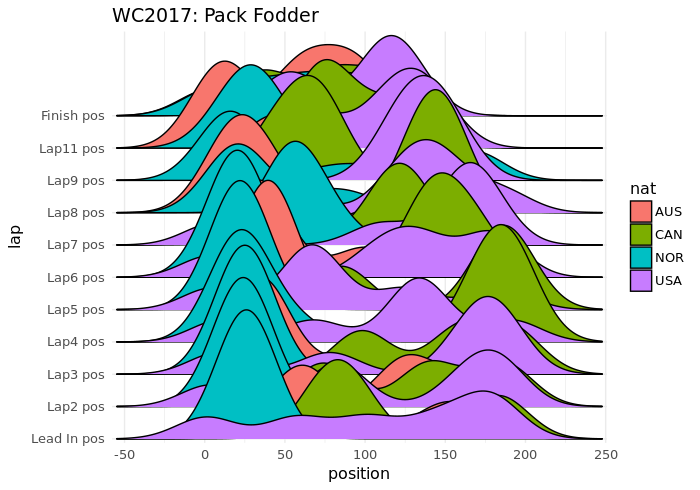
Can’t finish without a joyplot (ridge plot) right? This shows pretty effectively that Canada and USA were just pack fodder in the race. Australia and Norway had their team near the front pretty much constantly throughout the race, while USA and Canada were more right skewed in distribution.
Later analysis
That was a fun quick analysis on just position, but what about how positions deviated through the laps? Or how about looking into what the distribution of speeds were like based on position. Lots more to be looked at in this data, but back to work I’m paid for.