Telling a story with data
Christchurch
Billy Fung /
2017-09-19
Small data big charts
All the hype these days has been about data science and machine learning and how everybody can pick up those hot skills and land a high paying job. I’m not saying that it’s as easy as that, but often you have to know where to look, and what you’re looking for. A bit like gold panning during the gold rush… Sometimes you might just hit jackpot.
I’ve been interviewing and recruiting a bit right now and one of the questions I’ve been asked often is: “What do you do on a daily basis?” Quite a valid question, and I had already thought about this beforehand while I was trying to ponder what I might display on a screen to interest students. Often my job is to find sources of vectors of data that might be a piece of the puzzle that is the electricity market. And the first step of that process is getting the data, and then looking at it.
    ggplot(data=demand[nzyear>=2009 ]) +
      geom_point(aes(nzday, avg, colour=node)) +
      facet_grid(nzyear~nzmonth) +
      theme(axis.text.x  = element_text(angle=90, vjust=0.5, size=7))
I’m a big advocate of large screens because I usually like to lay everything
out to bring with, then start to whittle the data down into smaller pieces.
Not dissimilar to an artist starting off with a large block of marble before
chipping it down. A very useful tool for multi dimensional data is
facet_grid(), especially if it’s time series data that you can break up into
years and months.
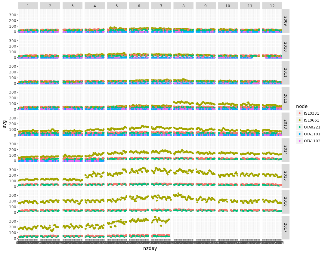
In the chart above, I’m plotting electricity demand at certain nodes, and looking for anything that might stand out. Signals that might allow me to cluster the data in a certain way, or characterise a certain feature.
August 2012
First thing that stands out is August 2012 looks a bit different, one of the nodes has a higher value compared to previous years. What might have caused this change? Is this something we can use to split the data into groups? Turns out in February of 2011, there was an earthquake in Christchurch, and then another quake in June 2011. The disasters resulted in widespread damage to buildings, especially older buildings. Come winter 2012, a year of rebuilding had finished, and people started moving back. The data shows the older buildings being knocked down, older buildings that relied on chimneys for heating. With newer buildings, electricity is used to heat the houses, so it is expected that winter has higher electricity demand compared to summer.
April 2015
The next weird bleep looks to be a higher than historical average April month. This is the fall season for New Zealand, but in 2015 winter came early for Christchurch. It snowed in April of that year, which resulted in everybody turning their heaters on a month earlier compared to the past. And then the winter year itself resulted in a higher overall demand, maybe due to it being a colder winter, or a longer winter.
Picking the easy winnings
The two signals I listed above are just a starting point, the next step is to continue diving deeper into the data to figure out what more there is to find. This is all part of the data analysis fun, being able to take numbers and tell a story.